Components
Components are the individual building blocks of your paywall that can be arranged and configured to create your own custom layout.
Core
| Component | Parent | Description |
|---|---|---|
| Text | ❌ | Used to add customizable text strings |
| Image | ❌ | Used to add an uploaded image |
| Video | ❌ | Used to add an uploaded video |
| Icon | ❌ | Used to add a customizable icon from our provided list |
| Stack | ✅ | Used as a parent component to jointly configure its child components |
| Footer | ✅ | A configurable portion at the bottom of the screen whose position can be fixed and uniquely styled. |
| Header | ✅ | A configurable portion at the top of the screen whose position can be fixed and uniquely styled. |
Paywall
| Component | Parent | Description |
|---|---|---|
| Package | ✅ | Used to add a selectable package with custom styling, text, etc. |
| Purchase button | ✅ | The call to action that invokes a purchase attempt of the selected package. |
| Express checkout buttons | ✅ | Allows users to show Apple Pay and Google Pay quick purchase buttons on web. |
Interactive
| Component | Parent | Description |
|---|---|---|
| Tabs | ✅ | Used to display different package groups in different tabs when offering multiple tiers of service, product types, etc. |
| Switch | ✅ | Used to add a toggle to your paywall that can be used to let customers choose between two different sets of options. |
| Button | ✅ | Used to add other interactions; such as a link to your Privacy Policy, a back button, etc. |
| Carousel | ✅ | Used to add a carousel of pages that a customer can swipe through |
Content
| Component | Parent | Description |
|---|---|---|
| Countdown | ✅ | Used to display a live countdown timer to a specific date and time |
| Timeline | ✅ | Used to add a timeline of connected items |
| Social proof | ✅ | Styled components that can be used as a starting point to display social proof, testimonials, etc. |
| Feature list | ✅ | Styled components that can be used as a starting point to display a list of features or benefits |
| Award | ✅ | Styled components that can be used as a starting point to callout awards your app has received |
Parent components all fundamentally act as containers that can contain other components within them.
Common component properties
Most components have common properties such as padding, margin, border, and more that can be used to control their look and layout. To learn more about these common component properties, click here.
Text component
The text component allows you to enter custom strings to display on your paywall. These strings can be sized, formatted, aligned, and colored however you'd like using the available properties.
Text components can additionally be embedded in other parent components like stacks or buttons to position them relative to other components within the parent.
All text components support variables, which are dynamic values that will be set based on the package being referenced. When a text component is within a package, its variable values will always refer to that package; and text components outside of a package will always refer to the currently selected package.
In addition, all text components support having a unique value for customers that are eligible for intro offers, promo offers, and multiphase offers so that you can reference those offers anywhere on your paywall. You can set this value using Rules.
Learn more about setting unique values for customers eligible for intro offers.
Custom fonts
Each text component can be configured to use a different font family of your preference. Fonts you can use include:
- System fonts
- Any of
sans-serif,serif, ormonospace - Custom fonts you upload to RevenueCat
To upload a custom font, click the gear icon next to the font family property to open the font modal. From there, you can upload a font file, and then select it as the font family for any text component.
Uploaded font files must be smaller than 5MB. We recommend keeping them under 2MB to ensure optimal loading performance.
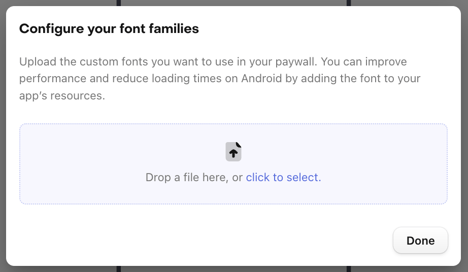
The available font weights in the paywall editor will be determined by the weights you upload for each font family, so be sure to upload each font weight you wish to use on your paywall.
The fonts you upload to to RevenueCat will be available to use in any text component on any paywall in your Project. When a paywall is displayed in your app for customers that uses a custom font, the font will be displayed directly from the file you've uploaded to RevenueCat.
You can reduce loading times and improve performance by adding the font to your app's resources. To do this on Android, click the three horizontal dots to the left of the upload button in the font modal to open the modal for specifying each font family's resource name.
Font size
Each text component's font size can be set to one of the available options, or any other value you manually type in.
Though these values represent pixels when rendering the paywall in the dashboard preview, they will be rendered using density-independent values on each platform where the paywall is loaded (e.g. points on iOS, density-independent pixels [dp] on Android).
Text color and gradients
Each text component's color can be set to a solid color or a gradient. Gradients allow you to create visually striking text by blending multiple colors together.
When configuring a gradient for your text, you can choose between:
- Linear gradients: Colors transition along a straight line at a configurable angle
- Radial gradients: Colors transition outward from a center point in a circular pattern
Both gradient types support multiple color stops, allowing you to create complex color transitions. Additionally, you can configure different gradient values for light and dark mode to ensure your text looks great in both themes.
Image component
The image component allows you to upload an image to display anywhere on your paywall.
Whenever you upload an image, we'll save it in a Media Gallery for your Project, allowing you to reuse it in any paywall.
Uploaded images must be smaller than 2MB, and we recommend keeping them under 1MB, especially if your paywall is initialized very early in your onboarding flow, to ensure all images have been loaded by the time a customer visits the paywall.
In addition to the standard properties that are common to other components, images have a few unique ones that can be used to more granularly control how your image is displayed.
Fit mode
An image's fit mode can be set to Fit so it is resized to fit the available space without cropping, or Fill, where it will fill the available space and crop where necessary.
Mask
An image's mask shape can be set to:
- Rectangle, with an optional corner radius setting
- Circle
- Concave
- Convex
Overlay
An image can have a overlay applied of a solid color or a gradient, along with a transparency property, to allow you to do things like:
- Add a background image with a semi-transparent overlay color that matches your app's branding
- Apply a gradient overlay to smoothly transition from the image to your paywall's background color
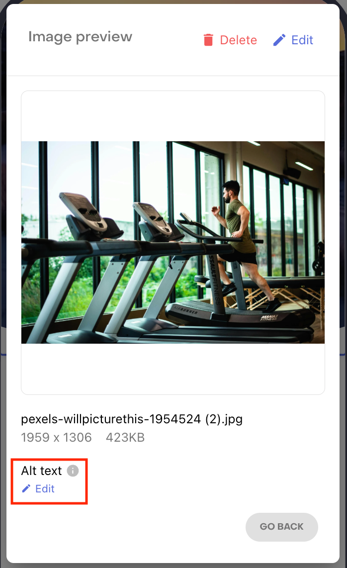
Alt text
Alt text can be configured for each image to make them more accessible.
To configure alt text, first open that image in the media gallery, which you can access by clicking on Replace image within an image component's properties. Then, hover of the image you want to edit and click the eye icon that appears to view its details.

Then, click Edit under Alt text to add descriptive text to the image, or to set it as a decorative image that does not require a description.
Video component
The video component allows you to upload a video to display anywhere on your paywall. Videos can be used to showcase your app's features, provide tutorials, or create engaging visual content for your paywall.
Whenever you upload a video, we'll save it in a Media Gallery for your Project, allowing you to reuse it in any paywall.
In addition to being added as their own component, videos can also be used as a background for your paywall, footer, or any parent component that supports a background being added to it through the Fill section in the component editor.
Supported videos
The video component supports MP4 & MOV upload formats; and converts all uploaded videos to MP4 for the best compatibility on mobile devices. We have a hard limit of 50MB for uploaded videos, but the final video file delivered to your customers will be smaller, as it is optimized for better loading performance.
Video loading and caching
Videos are loaded and cached efficiently to provide a smooth user experience:
- Initial load: When a paywall with a video is first displayed, the video frame is loaded immediately with a placeholder thumbnail image that's automatically generated by RevenueCat from the first frame of your video.
- Progressive loading: A low-res version of the video is downloaded first, allowing for playback to begin as quickly as possible, and is then replaced with the full-res version once its been downloaded.
- Local caching: Once downloaded, videos are cached locally on the device to enable instant playback on subsequent paywall views
- Bandwidth optimization: Videos are automatically compressed and optimized for mobile networks to minimize data usage
In addition to the standard properties that are common to other components, videos have a few unique ones that can be used to more granularly control how your video is displayed.
- Fit mode: A video's fit mode can be set to
Fitso it is resized to fit the available space without cropping, orFill, where it will fill the available space and crop where necessary. - Autoplay: Videos can be configured to automatically start playing when the paywall is displayed.
- Loop: Videos can be set to loop continuously, which is useful for many short demonstration videos or background content.
- Mute audio: Videos can be configured to play muted by default, which is often required for autoplay functionality on many platforms and provides a better user experience in public settings.
- Playback controls: Video playback controls can be shown or hidden, giving you control over whether users can pause, seek, or adjust volume.
We recommend keeping the default video settings of autoplay, loop, and mute audio; as these will result in the most natural user experience on a paywall the vast majority of the time. In addition, keep in mind that some settings combinations like no autoplay and no playback controls will not be supported, as they would prevent a customer from being able to play the video at all.
On iOS, if a customer has the system accessibility setting Reduce Motion enabled, videos will not autoplay even if autoplay is enabled on the paywall.
When displaying a video on macOS and watchOS, there may be a black border outside of the video component if you set it to the "fit" fit mode and design the component to take up more space than the video's aspect ratio naturally will.
Icon component
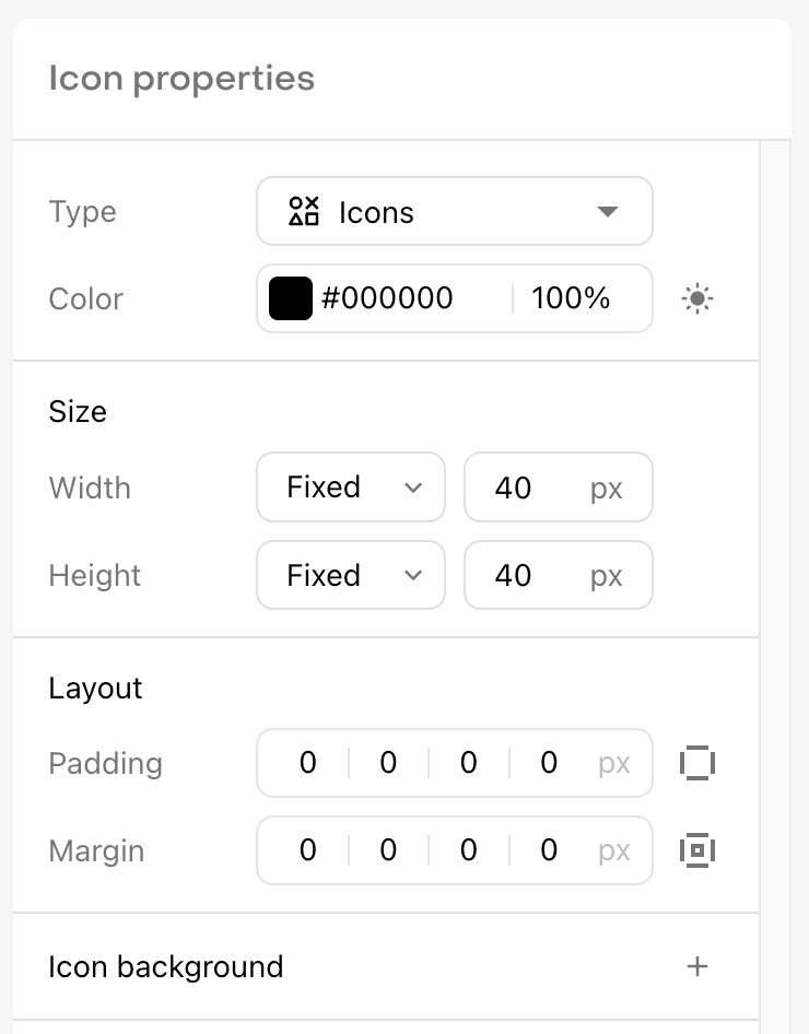
The icon component allows you to add an icon to your paywall from our predefined list. Each icon has a filled and outlined version, and can have its color, size, border, etc. custom configured just like other components.
Unlike other components, icons must always have a fixed width and height. Each icon has a 1:1 aspect ratio, so we recommend keeping these values identical if you want to maintain the icon's inherent aspect ratio.
Paywalls uses an icon library from Tabler, which means you can also search for icons to use from their site. Some permutations are not available in RevenueCat, but if you see one you'd like to use let us know!
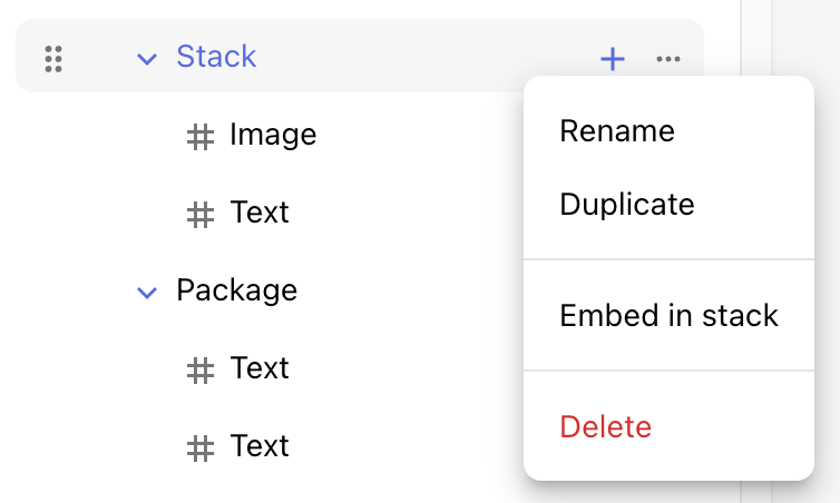
Stack
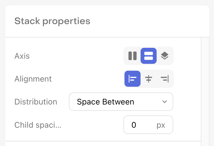
The stack component allows you to create a container of underlying components that can be jointly configured.
Stacks, and all other parent components, have position properties that determine how the child components are arranged within the parent. This allows you to control the axis on which those components are aligned, how they're aligned, how they're distributed, and the spacing between each child component.
To add a component to a stack, click the + button in that stack's row in the Components Panel. You can also drag any existing component into a stack, or click the ... button on existing component to Embed in stack, placing it within a new stack.
Header
If you'd like to have a fixed header at the top of your paywall, you can add one using the header component.
Once added, the header component will always be fixed to the top of your paywall, and its size will be relative to its properties and the size of the components within it.
To differentiate between your header and your other paywall content, we'll add a drop shadow by default, though this can be customized or removed if you'd prefer.
Headers can contain a subset of components, including:
- Stacks
- Text
- Images
- Buttons
- Icons
Layout behaviour
Dependant on the ordering of the content in the main "Paywall" section, you will see a slightly different layout behaviour.
| Image first | Other components first |
|---|---|
 |  |
| If the first component in your Paywall is a full-width image; it will render at the top of the screen, beneath your header. | If the first component in your Paywall is not a full-width image; it will render below your header, and scroll behind. |
Requires minimum SDK versions (iOS 5.68.0, Android 10.2.0)
Footer
If you'd like to have a fixed footer at the bottom of your paywall, you can add one using the footer component. This is especially important if you want to add optional content to your paywall that a customer may want to explore if they're interested, but don't necessarily want things like the purchase button buried beneath that content.
Once added, the footer component will always be fixed to the bottom of your paywall, and its size will be relative to its properties and the size of the components within it.
To differentiate between your fixed footer and your other paywall content, we'll add a drop shadow to your footer by default, though this can be customized or removed if you'd prefer.
Package
The package component allows you to add a package to your paywall which your customer may select to purchase. Since a package is a parent component, you can add any other components within it to style your package however you'd like.
At the top of the properties list, you'll need to select the package from your Offering that this package component should reference, and then decide whether this package should be selected by default when a customer loads your paywall.

In addition, packages are unique in that they can have both a Default and a Selected state configured for them, so that you can add unique styling to differentiate the two; such as a unique icon, border color, or background.
Learn more about selected state styling.
The package component defines the selectable area that a customer may tap on to select the package, so be sure to create suitable margin between it and other elements to make it easy for customers to tap on the correct package.
Purchase button
The purchase button is tied to your packages, and is how a customer begins the purchase process with the store.
It's shape can be configured as a pill, or a rectangle with a configurable border radius; and as a parent component it can also contain other components within it, which you might use to show multiple lines of text, an icon, etc.
Web Purchase Button
To add an external link to an app-to-web checkout within your paywall in supported countries, you can use a Web Purchase Button. Learn more about the Web Purchase Button here.
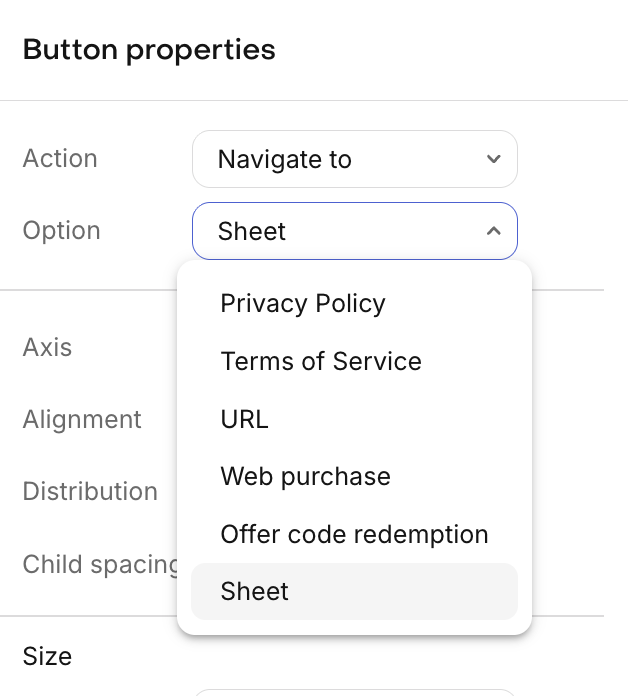
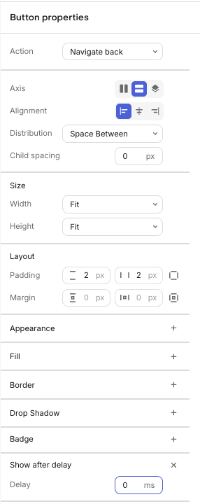
Button
For all other buttons you may wish to add on your paywall, you can use the button component. The key difference between a button and other stacks is that it has configurable Actions.
You can choose from the following actions:
- Restore Purchases
- Navigate back
- Navigate to
Navigate to additionally supports navigating to your Privacy Policy, Terms of Service, any other custom URL of your choosing, offer code redemption sheets on the App Store, or custom configured sheets. URLs can be opened via In-App Browser, External Browser, or Deep Link.
Inapplicable buttons such as Restore Purchases, Navigate back, and Web Purchase Buttons will not be displayed on paywalls when they are served on the web; and will instead be invisible in the space they would otherwise occupy.
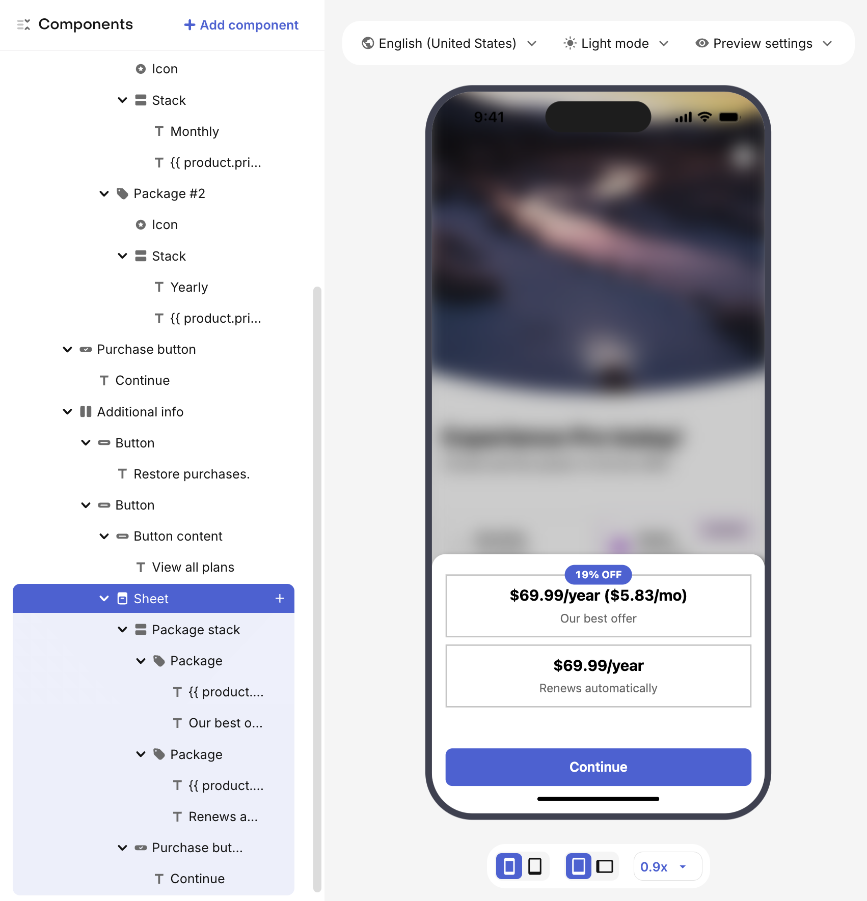
Navigate to sheet
You can choose to have your button navigate to a sheet that can be used to display additional content.
When you select a sheet as the destination to navigate to, you'll see a new Sheet component inside of your button in the Components panel. When the sheet or any component within it is selected, you'll see the sheet displayed in the paywall preview. You can add components to the sheet just as you would to any other stack.
Sheet's can have their own packages & purchase buttons so that customers can directly make a purchase from the options displayed within the sheet.
Delayed visibility
For close/back buttons, you can optionally configure a delay before the button becomes visible to users. This can be useful when you want to ensure users view your paywall content for a minimum duration before allowing them to dismiss it.
The delayed close button feature requires the following minimum SDK versions:
- iOS: 5.37.0+
- Android: 9.4.0+ (or 8.24.0+ for backwards compatibility with Google Play Billing Library 8)
- React Native: 9.4.0+
- Flutter: 9.5.0+
- KMP: 2.1.3+17.6.0
On older SDK versions, the delay configuration will be ignored and the button will be immediately visible.
Delayed close buttons may be rejected during Apple's App Review process as they can be seen as preventing users from easily dismissing paid content, so be sure to take this in account when enabling it.
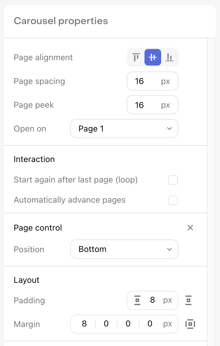
Carousel
The carousel component allows you to create a carousel of pages that a customer can swipe through. These pages are their own stacks, and therefore can contain almost any other components that are supported in Paywalls.
To control how pages are displayed in the carousel, you can configure the following properties:
- Page spacing: Determines the space separating each page in the carousel
- Page peek: Determines the portion of the prior and later pages which will be visible (if applicable)
- Open on: Determines which page will be open when the carousel is first displayed
- Start again after last page (loop): Determines whether the carousel will loop back to the first page after the last page is reached
- Automatically advance pages: Determines whether the carousel will automatically advance to the next page after a configurable delay
The earliest beta versions of our iOS SDK do not support the carousel component. We recommend updating to at least the minimum recommended version to get all fixes and improvements from the beta period.
Page control
Each carousel has a Page control component that allows you to customize the appearance of the controller, or if the individual Indicators. Page indicators can be modified to have a unique appearance based on whether they are in the default state or the active state.
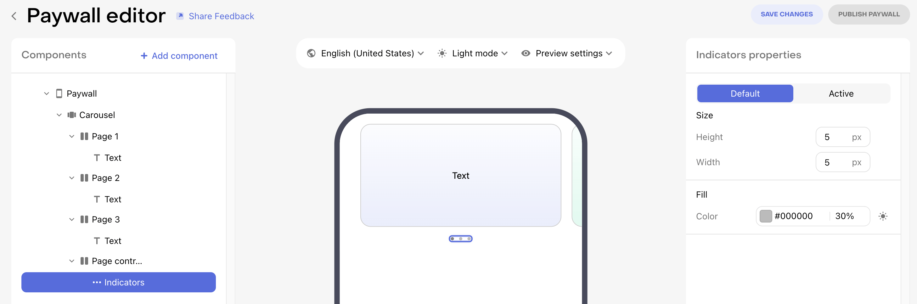
In addition, the position of the page control component can be set to Top or Bottom via the carousel component.
Countdown
The countdown component allows you to display a live countdown timer to a specific date and time. This is useful for creating urgency around limited-time offers, sales, or special promotions on your paywall.
The countdown component contains three different configurable stacks:
- Countdown Stack: The content displayed while the countdown is active
- End Stack: The content displayed when the countdown reaches zero
- Fallback Stack: The content displayed if the Countdown component is not available on the SDK version being used by the customer. Learn more
Counting down from a dynamic value like the paywall's open time is not yet supported, but will be coming in the future.
Configuring the countdown
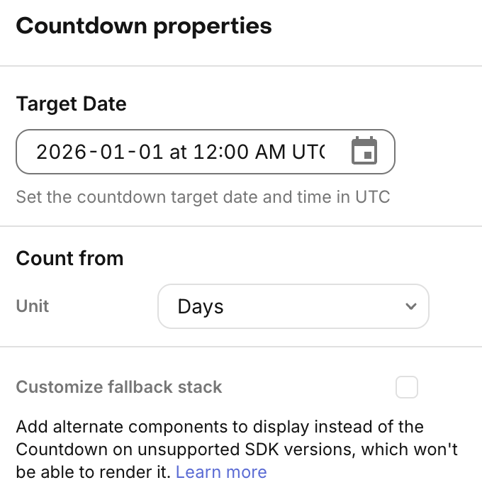
To configure your countdown, you'll need to set:
- Target Date: The date and time (in UTC) when the countdown will end
- Count From: Choose whether to display the countdown in days, hours, or minutes:
- Days: Shows total days with remainder hours, minutes, and seconds
- Hours: Shows total hours with remainder minutes and seconds
- Minutes: Shows total minutes with remainder seconds
Countdown variables
Within any text component inside the countdown stack, you can use countdown-specific variables to display the time remaining:
| Variable | Description | Example |
|---|---|---|
| count_days_with_zero | Days remaining with leading zero | 07 |
| count_days_without_zero | Days remaining without leading zero | 7 |
| count_hours_with_zero | Hours remaining with leading zero | 04 |
| count_hours_without_zero | Hours remaining without leading zero | 4 |
| count_minutes_with_zero | Minutes remaining with leading zero | 09 |
| count_minutes_without_zero | Minutes remaining without leading zero | 9 |
| count_seconds_with_zero | Seconds remaining with leading zero | 03 |
| count_seconds_without_zero | Seconds remaining without leading zero | 3 |
Learn more about using variables in text components.
Example usage
A common countdown format uses text like:
{{ count_days_with_zero }}:{{ count_hours_with_zero }}:{{ count_minutes_with_zero }}:{{ count_seconds_with_zero }}
This would display as: 07:04:09:03 for 7 days, 4 hours, 9 minutes, and 3 seconds remaining.
You can customize the display however you'd like by adding additional text components with labels, using different formatting, or arranging the components in various layouts within the countdown stack.
Time's up
When the countdown reaches zero, the component automatically switches to display the End Stack content. You can use this to show a message like "Offer expired" or hide the countdown entirely by leaving the end stack empty or minimal.
The countdown updates in real-time while the paywall is displayed, automatically ticking down each second until it reaches zero.
Offering time-sensitive packages
A powerful way to use the countdown component is to display different packages in the Countdown Stack and End Stack. This allows you to offer a special promotional package while the countdown is active, and then show your regular packages once the countdown expires.
For example, you might want to:
- Show a discounted introductory offer package in the countdown stack
- Switch to your standard pricing packages in the end stack after the promotion expires
To implement this pattern:
- Create all the packages you need in your offering (both promotional and regular packages)
- In the Countdown Stack, add your promotional package components and purchase button
- In the End Stack, add your regular package components and purchase button
- Style each stack to clearly communicate the difference in offers
This approach creates a sense of urgency around your promotional pricing while ensuring customers can still make a purchase after the countdown ends at your regular prices.
When creating packages for this pattern, consider using custom package identifiers to differentiate between promotional and regular offers:
monthly_promo/annual_promofor promotional packagesmonthly_standard/annual_standardfor regular packages
All packages must be included in the offering used by the paywall.
Fallback stack
If you're serving a paywall with a Countdown component on SDK versions that do not support it, the component won't render. Therefore, we recommend enabling the fallback stack for the component so you can customize exactly what you'd like to display in its place.
Or, alternatively, if you'd like to show a different paywall to customers on unsupported SDK versions/app versions, you can do that via Targeting.
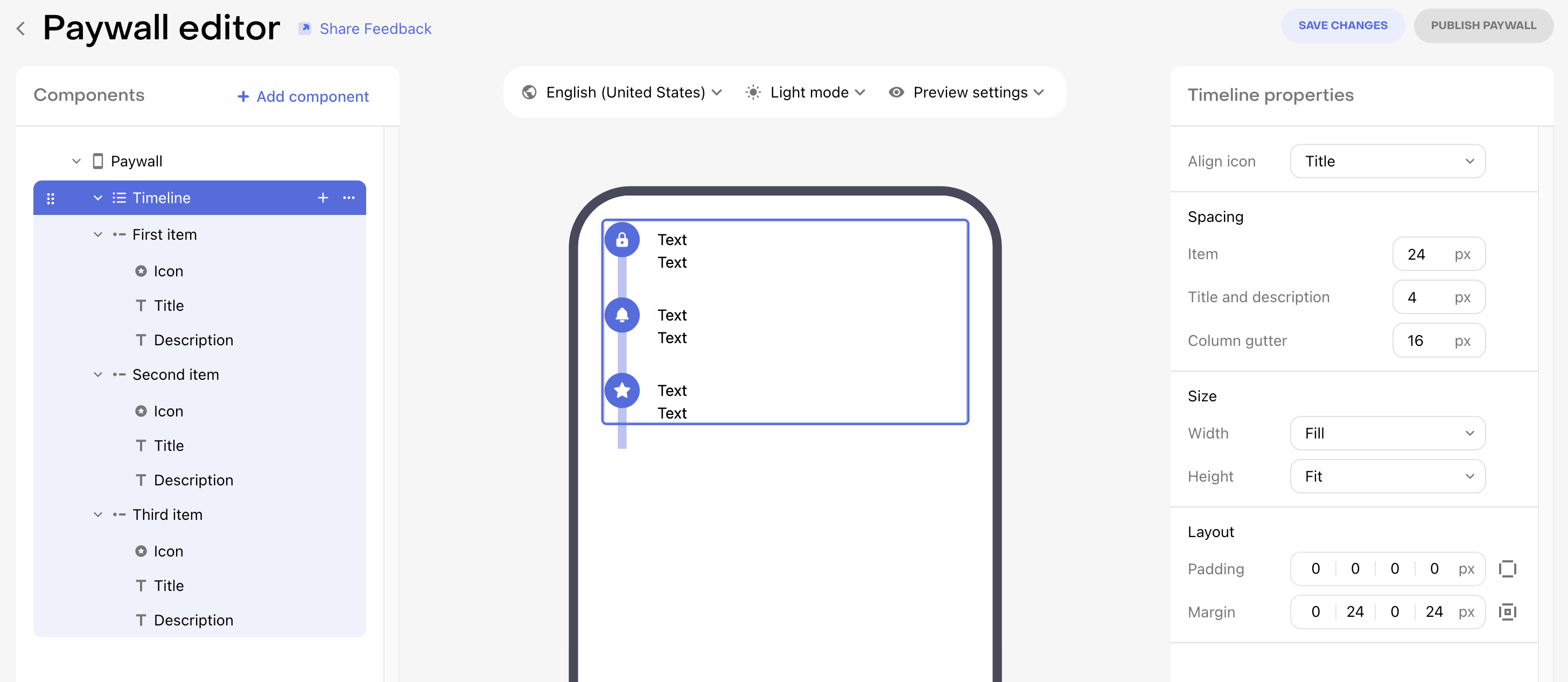
Timeline
The timeline component allows you to create a vertical stack of items that can be connected to simulate a timeline, or any other progression you want to illustrate.
To control how items are displayed in the timeline, you can configure the following properties:
- Align icon: Select between the icons being aligned with the Title or the Title and description
- Spacing of an Item: The vertical space between each item in the timeline
- Spacing of each Title and description: The vertical space between the title and description of each item
- Spacing of each Column gutter: The horizontal space between the vertically connected icons of each item and their text & description
Within each item component, you can configure the properties of its connector to control its width, vertical margin, and color.
A connector's position begins and ends at the center of each icon it intersects with. If you want to instead set the connector to start or end before those points, add enough vertical margin to move its start or end point beyond the space covered by the icon.
All items in a timeline must have an icon and a title, but the description field is optional and can be deleted if it is not desired. Each of those components can be configured individually, just as they can outside of a timeline.
Tabs
The tabs components allows you to add a tabbed interface to your paywall, which can be used to display different content in each tab; especially different package groups when offering multiple tiers of service, product types, etc.
Managing tabs
Each tabs component contains:
- A dropdown to select the tab to display & modify
- A stack for that tab's content, which contains both:
- The tab buttons, and
- The content of the tab beneath the buttons

The dropdown allows you select which tab to display and modify. To add a new tab, you can either open the dropdown and select + Add tab, or you can click the three horizontal dots to the right of the dropdown and select Duplicate to create a copy of the current tab.
To change the tab which is selected by default when a user reaches your paywall, use the Default tab property on the tabs component.
Tab buttons
The tab buttons stack allows you to control the styling of the tab selector. Changes to the tab buttons will apply to all tabs, to ensure a consistent user experience when switching between tabs.
Each tab has both a default and selected state which can be configured to have a unique appearance so that the user understands which tab is currently selected.
Tab content
Each tab acts as a parent component which can contain any other components within it. In addition, any components within a tab can be duplicated to another tab to make designing each tab easier. Just click on the three horizontal dots to the right of a component within a tab to see the option to Duplicate on each additional tab.
Each tab can have its own package selected by default. This is the package which will be selected when the user first navigates to that tab.
Adding packages for each tab
The packages that you want to include on your paywall must all be included in the offering being used by the paywall. Instead of using RevenueCat's standard package identifiers (e.g. $rc_annual) when creating these packages, you may instead want to use custom package identifiers since (1) each package identifier must be unique and (2) you can then easily differentiate what's being offered by the identifier.
For example, your package structure may look like this:
basic_monthlybasic_annualpro_monthlypro_annual
Then, you can create tabs either for each entitlement (Basic and Pro), or for each period (monthly and annual), depending on how you want to present the options to your customers.
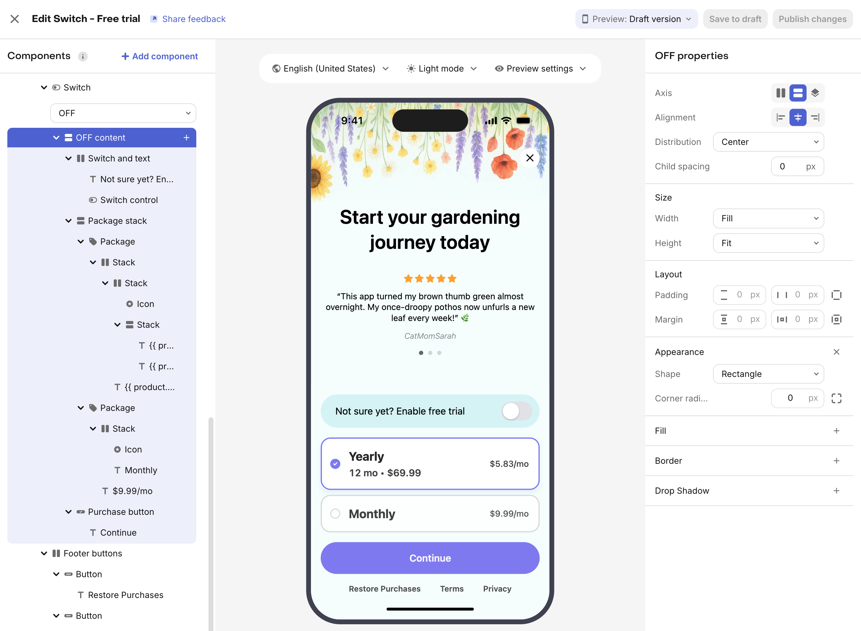
Switch component
The switch component allows you to add a toggle to your paywall that can be used to let customers choose between two different sets of options. Switches are frequently used to offer a set of packages that do/don't offer a free trial, do/don't offer family sharing, etc.
To modify the appearance of all content within a switch, and have those appearance changes apply to both the OFF and ON state, you can use the Switch component in the components panel.
To modify the content within the OFF or ON state, use the OFF content and ON content components respectively.
After configuring one of the switch states to your liking, you can duplicate any of the components within the switch to the alternate state so that you have an easier starting point when modifying that other state.
The switch component will be displayed as a native switch element on both iOS and Android. The dashboard preview uses the iOS styling to illustrate the appearance, so expect the on device appearance to be different on Android in line with the native platform component.
Adding packages for switch state
The packages that you want to include on your paywall must all be included in the offering being used by the paywall. Instead of using RevenueCat's standard package identifiers (e.g. $rc_annual) when creating these packages, you may instead want to use custom package identifiers since (1) each package identifier must be unique and (2) you can then easily differentiate what's being offered by the identifier.
For example, your package structure may look like this for a paywall using the switch component to offer a free trial toggle:
monthly_no_trialannual_no_trialmonthly_with_trialannual_with_trial
The _no_trial packages would represent the packages without a free trial, and the _with_trial packages would represent the packages with a free trial; so that you could place the first set in the switch's OFF content and the second set in the switch's ON content.
Social proof, feature list, and awards
These component categories are pre-styled components from RevenueCat that can be used as starting points or inspiration to add this type of content to your paywall. Fundamentally, they are no different than any other stacks, and therefore can be customized and configured to your liking.
Express checkout
The express checkout component allows you to offer quick purchase buttons like Apple Pay and Google Pay directly on your paywall when its served on the web. This provides a more seamless, app-like purchasing experience for users on mobile devices from the web, similar to the native app experience.
RevenueCat Paywalls can be used on the web through our Web Purchase Links, or on your own custom web experience using the Web SDK.
How it works
The express Checkout component is designed to handle the different states of digital wallet availability. It contains three different stacks that you can customize:
- Express checkout available: Shown when a digital wallet (like Apple Pay or Google Pay) is supported and ready to use on the user's device and browser.
- Express checkout unavailable: Shown when no digital wallet is available. This allows you to show an alternative, like a standard purchase button, to ensure users can still complete their purchase.
- Loading state: Shown while RevenueCat is determining if a digital wallet can be used.
The Wallet component is a placeholder that automatically renders the appropriate digital wallet button (e.g., Apple Pay on iOS/Safari, Google Pay on Android/Chrome) based on the user's device and browser.
Customizing the experience
By using the express checkout component alongside other components, you can customize how the express checkout option is presented. For example:
- When express checkout is available, you can show the Wallet component (Apple Pay/Google Pay) prominently, and perhaps a less emphasized Purchase Button below it to give the user the ability to checkout with other payment methods if desired.
- When express checkout is unavailable, you can show a standard Purchase Button at full prominence that opens the standard checkout flow.
This flexibility allows you to guide users toward the most seamless payment method when available, while always providing a fallback.
Requirements
Express checkout is currently supported on web paywalls. To use it, ensure you have:
- Configured Apple Pay and Google Pay in your Stripe account and registered your domains. See Payment Methods for more details.
- Added the Express checkout component to your paywall in the Paywall Editor.